
Keynote Speaker - Eve Ashcraft
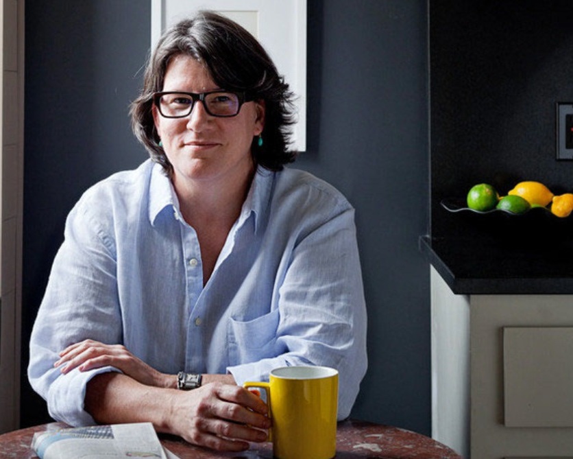
Eve Ashcraft, author of “The Right Color” and founder of Eve Ashcraft Studio
Tuesday, June 9 at 11:00am
Practicing Color in Context: Navigating through History, Human Dynamics, and Informed Inspiration
To be working with color is akin to weather prediction; we are tied to something that is constant, yet ever-changing and at times, elusive. My daily handrail through my process has been a constant acknowledgement of context. To understand color is to know and see how and why it functions in situ. In my work context extends beyond the physical reality of built space into history, human dynamics, and modernity.
I am a lover of history. Knowing more about the past informs many of the decisions that I make in my work. It’s also allowed me the freedom to not be a slavish historicist when it comes to assigning color in built space. This potential irreverence has its limits though, since I also have great respect for architecture. I find that this mix of knowledge and respect gives me a solid working platform, a contextual foundation that bolsters and inspires my ideas. For example, the ultramarine blue panels that punctuate a New York City building by architect Cary Tamarkin sprang from a discussion with Cary about Le Corbusier. I depend on historical precedents and references not as things to copy but as informed inspiration.
Since all of my work involves what can be called a “group effort”, I rarely make decisions without input from my clients whether they are private individuals, architects, museums or companies. In addition, coop boards, friends, families, neighbors, and contractors get in on the act. It seems as if the whole world will give you their opinion when it comes to color. It pays to have a keen filter and a sense of diplomacy to navigate through the noise. I am pleasantly surprised by how intimate color is for many of my clients. I often feel like I’m guiding them into the great unknown even if we’re just looking at something only slightly more pigmented than white. I take this adventure seriously and relish bringing my clients into a more personalized colorful space. This interaction between people is filled with every emotion and idea possible.
My projects touch upon a broad range of conditions from intimate residential interiors to wayfinding through vast public spaces. All of it is impacted by modern technology, with developments accelerating in the past ten years. All of us are faced with a rapidly changing visual world. Our sensitivity to color has been greatly impacted by omnipresent backlit screens. Additionally, we have to grapple with the Wild West of modern lighting, where the changing of a lightbulb can make or break a color plan in an instant.
I sometimes have a fairly comical image of myself with a foot in the past, a foot in the future and my arms wrapped around a project. It’s my job to see beyond the beautiful or inspirational into the specific and hardworking aspects of color. To quote myself, my favorite color: the one that works.
Bio
Eve Ashcraft is a rare commodity in the design world, an expert on everything to do with color. For 20 years, her firm, Eve Ashcraft Studio, has consulted with designers, architects, private clients, and businesses on colors for everything from interiors, exteriors, and corporate branding to paint lines and knitting yarn.
A painter by training with a BFA from the Rhode Island School of Design, Ashcraft approaches color with an artist’s eye coupled with a keen sense of light and context. Her holistic approach consistently marries colors to spaces, forms, and materials as well as to her clients’ sensibilities. Ashcraft’s career has taken her literally all over the country and figuratively all over the map. In addition to developing color palettes for hundreds of architectural projects, she has consulted with Richard Avedon on the typeface palettes for his book covers, determined the ideal shade of cream for watchfaces for Banana Republic, and even recommended a color for a client’s dental veneers. The palettes she developed for Martha Stewart Living’s inaugural paint lines, the Araucana Colors and Everyday Colors, turned designer paint into a mass-market sensation.
Always expanding her exploration and understanding of color, Ashcraft released her first book, THE RIGHT COLOR (Artisan Books) in 2011. Both visual delight and smart primer, this definitive guide to color and paint distills two decades of experience into eye-opening and approachable lessons. Treating the reader as a private client, she offers step-by-step guidance in developing one’s personal palette and then applying it at home.
Also launched in Fall 2011, Ashcraft’s own line of paint, Eve Ashcraft Color: The Essential Palette, produced by Fine Paints of Europe. Acknowledging the paralysis people experience in selecting colors from the thousands most paint lines offer, Ashcraft has created a finely-edited range of 28 colors that not only stand alone but work seamlessly with each other. In a helpful cross-pollination, THE RIGHT COLOR includes recommendations from The Essential Palette for wall, trim, and ceiling color as well as suggestions for adjacent rooms.
In 2013-14 Ashcraft completely redeveloped the Ralph Lauren paint line, adding hundreds of new colors and reorganizing their presentation as well as their names. Recently Ashcraft has been involved with several large residential projects working directly with architects and clients to create finely tuned interior spaces that enhance significant art collections, a challenge that she particularly enjoys. In addition to her practice Ashcraft teaches graduate level architecture students about color at Parsons The New School for Design.